Categories
Uncategorized

Data Viz – P.3

There’s nothing like walking to your car and seeing an orange greeting card waiting for you. Well, unless you spoil the surprise and catch your Secret Santa in the act of writing it. But either way, there’s a sense of warmth that fills you. Sure, some might say that warmth is actually rage, but the feeling is real nonetheless. And so is the ticket. Unless… what ticket?

How many outstanding parking tickets are out there and what are they worth?

My audience is anybody. Drivers, passengers, residents, visitors, and anybody that wouldn’t mind seeing the answer to these questions even if they’ve never been to New York City. Using NYC Open Data, Open Parking and Camera Violations were filtered to contain only tickets with an outstanding balance. This had to be aggregated prior to being exported using the platform’s tool (still in beta).

LINK TO WORKBOOK

My design has evolved to create a set of visualizations that I hope are viewed as trivia or a data-meme for lack of better words. I attempt to keep this lighthearted by using playful titles and background images, not so much with the visualizations themselves. They are not complex layouts, but the environment is not meant to keep the audience hooked. It’s meant to be a source of information that might one day become a random “by the way, did you know…” shared with others.

The landing page is a map of the US placed on the infamous orange envelope that accompanies parking tickets. The map contains the 50 states and Puerto Rico. Washington DC is not visible due to its size and because the ability to pan/zoom was disabled to keep the layout stable. New York was given its own distinct color so it does not skew the scale for other regions. Tooltips give basic (but powerful) information to ensure the audience doesn’t get overloaded. The bar graph in the bottom right corner accounts for datapoints that could not be mapped.

This dashboard contains a few subtle easter eggs including the stamp, address line, and a bit of information about the envelope itself. From here, the audience can navigate to one other dashboard. This forced navigation was intentional. My thinking behind this was “yes, that envelope might’ve been a bit triggering. Let’s remember we’re here for trivia.”

The 2nd dashboard lists regions that owe over $10 million or have a relatively high tickets per vehicle ratio. The titles are meant to reassure the audience that it’s ok to relax. The background image shows an official flipping through an assortment of hilariously cringeworthy fake license plates. A 3rd dashboard presents a tree map of the regions owing less than $10 million. Background images have a transparent overlay to make the visualizations more legible. The user can navigate to view the data from either the 2nd or 3rd dashboard.

I avoided visualizing the number of vehicles ticketed because I didn’t feel it added anything substantial.

Attempts at using logarithmic scales to display all regions did not have the desired effect of representing the magnitude of the disparities. Other attempts felt like overkill, wasted space, or unintentionally drew attention to the major players while potentially leaving other regions unexplored. This did not track with the “fun with data” approach I was aiming for. In a moment of serendipity, I noticed and verified that the envelope’s unused orange space relative to the bar graph would allow me to represent (but slightly underestimate) New York’s balance relative to another region. This is the only visualization where New York is visually represented. Data was aggregated before being exported due to the size of the dataset. I may need to include notes next to the data to explain my classification and naming process. There were a handful of naming/abbreviation assumptions that I made which may not be intuitive. I’m not thrilled about having an abundance of bar graphs nor being able represent all the data in one view. An in-person visualization may be a better approach for this.
Categories
Uncategorized

Data Viz – P.2

Do I text please/thanks more often than others?

Have we lost our manners or has technology brought about a new social etiquette that manages to compress our gratitude? The reminder to “please say please once in a while” has come up before with a close friend. Maybe I’m old fashioned and tend to use these phrases more frequently. Am I using (or overusing) these phrases compared to those I am in contact with?

I am the audience, but I am not the sole viewer. As such, I made attempts to present my quantified self in a way that entices engagement.

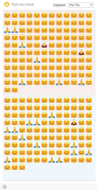
The visualization allows users to see when messages from selected contacts contained “please” or “thank you”. Contacts were placed in one of three groups: close, not so close, or distant. The user can change the contact type by clicking on the “person” icon in the top left. Sent messages are on top and received messages closer to the middle/bottom, like how they might appear on your phone. Hovering over the marks allows the user to see the phrasing used in that message (ex. thank you vs thanks) along with a timestamp. Emoji are used to represent the “subject” of the message (please, thank you, or both).

Click here to view dashboard. Embed will not format correctly.

SCREENSHOT ONLY

Text messages from 9 contacts were extracted from my new phone. Using excel, I determined if the messages contained the following phrases: please, plz, pls, thank you, thanks, thnx, tnx, or ty. Other messages were discarded. An “exclude” column was added to account for the numerous false flags for “ty”. During this process, I decided to verify all classifications and excluded additional messages that did not meet the contextual requirements. These cases were commonly a relay of another communication. The data now contains messages from June 2022 through November 4, 2022.

The suggestions and feedback provided by Professor McSweeney regarding data collection ultimately allowed the visualization to become more discrete (the initial idea was to represent the data as ratios). The data collection method enabled me to have meaningful tooltips and led to an overhaul in the entire presentation. Attempts to accurately account for the subjects (please and thank you) were particularly frustrating since I had continued using metrics and functions designed for the ratio method. Creating new classifications and adding a third “please and thanks” identifier solved this problem.

This project has been through several redesigns and many aesthetic refinements. The immediate next steps would be to continue to refine the visualization so it appears and functions more like a phone would. This includes reconsidering the presentation of the contacts lists, adjusting alignment on the emoji as well as text bubbles and shading, and framing the visualization in an appropriate “device”.

Categories
Uncategorized

Data Viz – P.1

Where and when are public urination complains made in NYC?
Most of us have seen (or possibly engaged in) public urination. When it’s reported, the data provide us with a starting point to see where and when people “go” where they shouldn’t. Are we dealing with late night or weekend partiers, or do we need to rethink our assumptions? I make a cautious attempt to inspire the audience to create theories of their own or have discussions with others about their experiences.

The audience is intended to be anybody with an interest in “funny” (but real) data, particularly students. It seems lighthearted, but its purpose is to entice others to spend more time thinking, talking, and clicking than they may have been inclined to when hearing about the topic.

This visualization allows users to see where and when public urination complaints were made. Users can filter the data to specific a date range, set time windows, and get a breakdown of the types of places complaints are made.

To those who haven’t studied the topic, the visualization shows that the answers to “where and when” may not be what they expected. It can also show how fed up some residents are.

Using NYC Open Data, 311 Complaint Data was filtered to include only Public Urination complaints. Each of the dashboard’s 4 visualizations were chosen to fit 2 criteria. First, the visualization had to be engaging. This does not necessarily mean interactive. Instead, the goal was to immediately trigger the audience to ask questions (serious or silly) and explore other aspects of the dashboard for more detail. Secondly, the visualization had to be informative while remaining unintimidating. This meant ensuring that visualizations were not complex, but also did not alienate the audience by providing information or analysis that they may feel is meant for “people who know about this stuff” (this stuff being data analysis/visualization or anti-public urination activism).

Click here to view dashboard if embed is not formatted correctly.

Moving Average
This was originally designed as a line graph, but the variations made it painful to look at and impossible to analyze. Viewing the data in weeks and using a moving average to smooth the visualization made this easier on the eyes. Converting it to a filled area chart allowed the data to be more readily interpreted as waves. Now at first glance, there seems to be a cyclical pattern, which hopefully has an immediate impact on the audience and a subconscious desire to find the rhythm of this visualization and the underlying data.

Time Report Created
I didn’t want to use 2 line graphs on the same dashboard if it could be avoided. I wanted each graph to have its own personality. Visually, this came out exactly as anticipated. The times of the highs and lows were unexpected.

Complaints by Location
This was initially a vertical bar graph of “Complaints by Borough”. I felt like it did not provide any data that the audience would find interesting (especially with a map already present). It also “stole” the personality of the previous graph. In short, it was there… and that was it. I went through the available data again and replaced it with the Location Type. The audience would have spent time in all of these locations and may take an interest in the data because of this relatable “where” to accompany the “when”. To give it its own personality, it is a horizontal bar graph which also makes reading the labels much easier (the only labels that aren’t datetime or numeric).

Map
The map shows “where” for the filtered “when”, but also provided the unexpected “who”. It can show instances where individuals were relentless in their reporting. Making the map reactive to the audience’s hovering over other charts in the dashboard provides incentive to explore and take control of the experience. Tooltips were excluded as they were not user friendly, nor did they provide meaningful insight.

Filters
The option to isolate weekends (arbitrarily starting at 6PM Friday) allows the audience to test a theory that weekends are a major factor for public urination complaints. The start/end times and date ranges invite the audience to explore and dive deeper into their own assumptions and analysis. It helps answer some questions and encourages the audience to embrace curiosity, potentially planting a seed for them to seek more information.

I could see this dashboard evolving to include the locations of publicly available restrooms to bring in the idea of whether there is a lack of facilities or knowledge that they exist. I’d also hope to find a way to include the weekend isolator on the heat map.