Do I text please/thanks more often than others?
Have we lost our manners or has technology brought about a new social etiquette that manages to compress our gratitude? The reminder to “please say please once in a while” has come up before with a close friend. Maybe I’m old fashioned and tend to use these phrases more frequently. Am I using (or overusing) these phrases compared to those I am in contact with?
I am the audience, but I am not the sole viewer. As such, I made attempts to present my quantified self in a way that entices engagement.
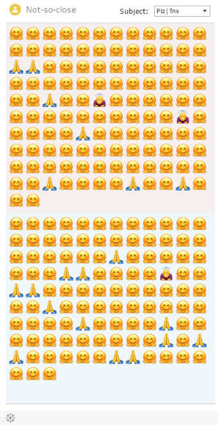
The visualization allows users to see when messages from selected contacts contained “please” or “thank you”. Contacts were placed in one of three groups: close, not so close, or distant. The user can change the contact type by clicking on the “person” icon in the top left. Sent messages are on top and received messages closer to the middle/bottom, like how they might appear on your phone. Hovering over the marks allows the user to see the phrasing used in that message (ex. thank you vs thanks) along with a timestamp. Emoji are used to represent the “subject” of the message (please, thank you, or both).
Click here to view dashboard. Embed will not format correctly.
Text messages from 9 contacts were extracted from my new phone. Using excel, I determined if the messages contained the following phrases: please, plz, pls, thank you, thanks, thnx, tnx, or ty. Other messages were discarded. An “exclude” column was added to account for the numerous false flags for “ty”. During this process, I decided to verify all classifications and excluded additional messages that did not meet the contextual requirements. These cases were commonly a relay of another communication. The data now contains messages from June 2022 through November 4, 2022.
The suggestions and feedback provided by Professor McSweeney regarding data collection ultimately allowed the visualization to become more discrete (the initial idea was to represent the data as ratios). The data collection method enabled me to have meaningful tooltips and led to an overhaul in the entire presentation. Attempts to accurately account for the subjects (please and thank you) were particularly frustrating since I had continued using metrics and functions designed for the ratio method. Creating new classifications and adding a third “please and thanks” identifier solved this problem.
This project has been through several redesigns and many aesthetic refinements. The immediate next steps would be to continue to refine the visualization so it appears and functions more like a phone would. This includes reconsidering the presentation of the contacts lists, adjusting alignment on the emoji as well as text bubbles and shading, and framing the visualization in an appropriate “device”.